There are a lot of different tools within Lightroom to manipulate detail of the image - playing with the light, the contrast, the sharpness, the color tones, and so much more. But we’re going to focus on the basics today so that you can start editing images right away and transforming everyday shots into something that really pops. So don’t worry if you see some of the panels and tools and don’t know what they mean.
Cleaning up the image
You can see the original image here:
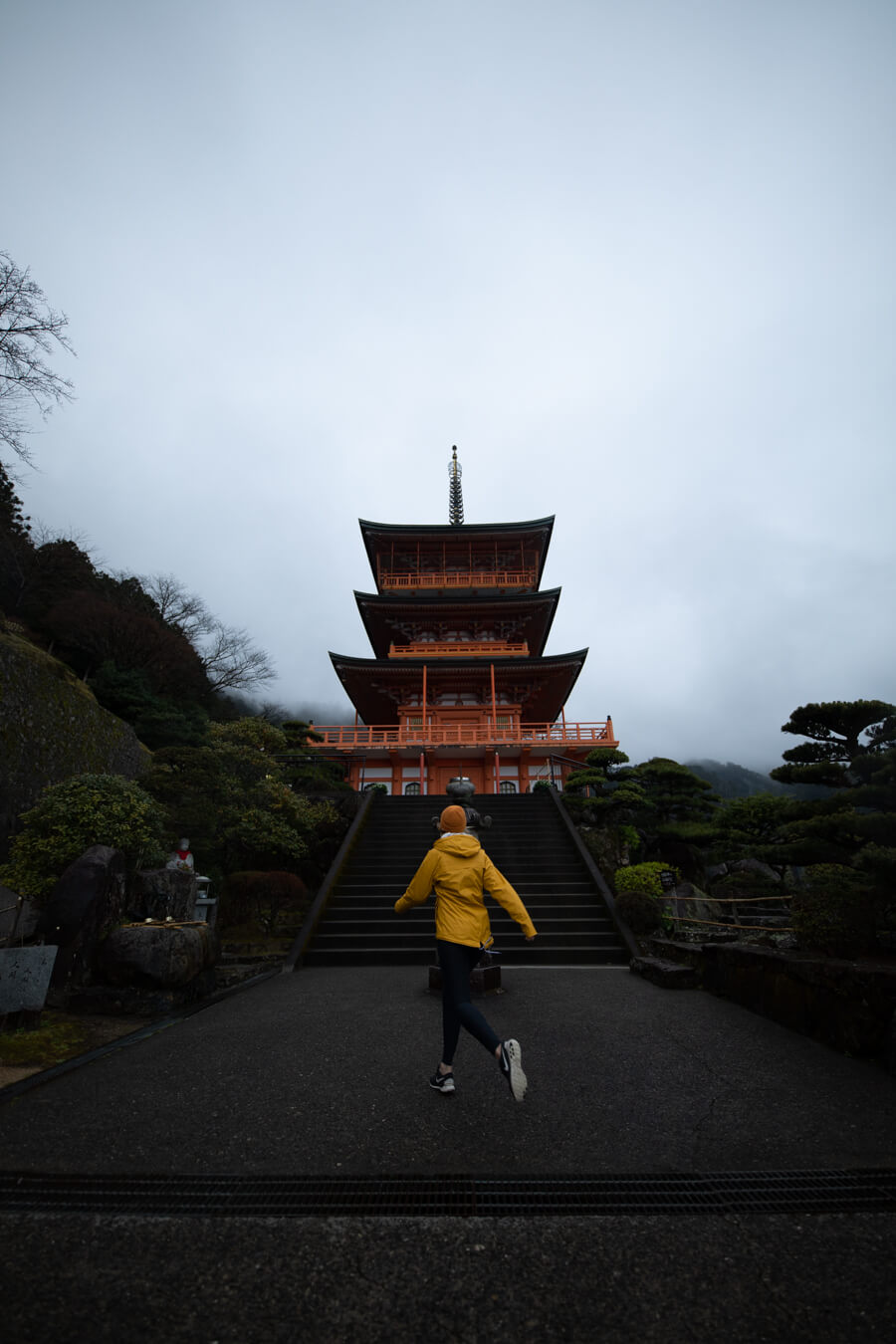
This is how our image originally looks like, which is pretty underexposed since I intend to preserve any possible bright parts of the image (highlights) up in the sky and avoid any clipping. Now, I use the Canon 5D Mark IV for this, it has a lot of dynamic range and it’s really good at preserving the darker part of the image (shadows). Lower end cameras might not have the same capability, so make sure you fully understand your camera before getting started. That said, most cameras generally do better at preserving shadows than highlights anyway.
- First, let’s go to the Basic panel and lift up the Exposure to +0.90
- Then go down to the Lens Correction panel and check on the “Remove Chromatic Aberration.” Different lenses have different amounts of chromatic aberration where lights and darks meet along an edge, which we normally like to avoid.
- Let’s also check on the “Enable Profile Corrections.” Lightroom has this built-in correction for the majority of lens manufacturers and models so checking on that option will do that correction automatically.
- When it comes to the distortion, low-end cameras usually have more distortion compared to the pros, and the wider the lens (the smaller the focal length number) the more distorted it will be. Also, in regards to the vignetting (darkening on the edge), I would like to keep a bit of that vignette perceptible. So I’m going to set the Distortion right at 100 and Vignetting at 30.
- Now, let’s go down to the Transform panel. You can manually fix the distortions through the available sliders but for this one I’m just going to click the “Auto.”
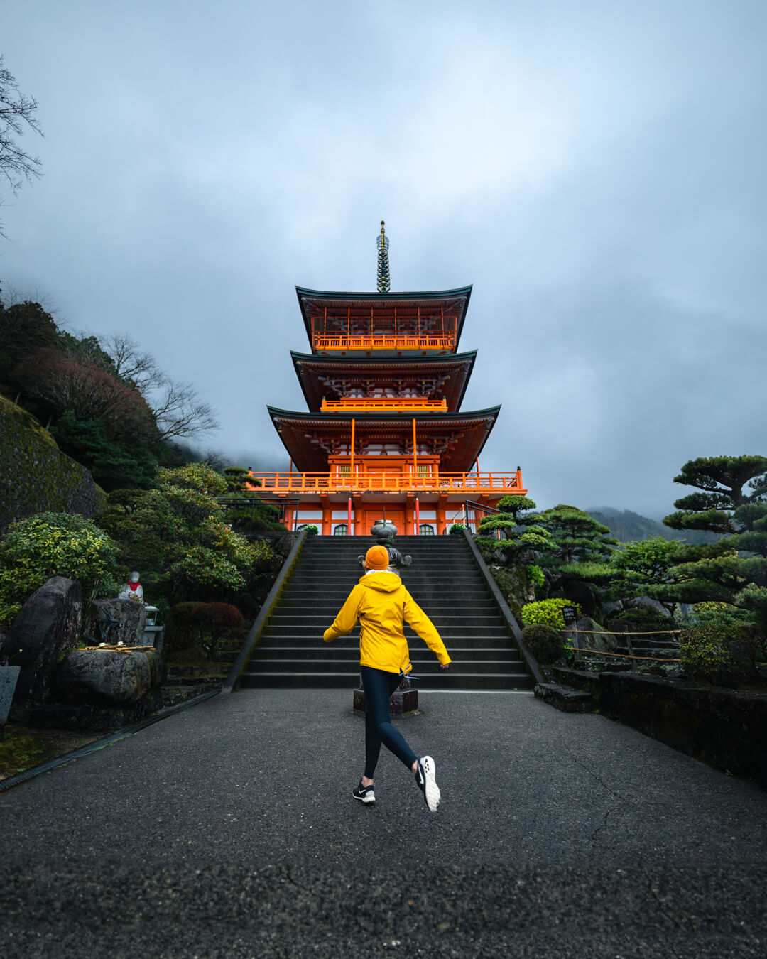
- Then go back up to the top of the Basic panel. Here you’ll see what’s called the Toolstrip, which is 4 icons that are newly revamped as a part of a major Lightroom update in October 2021. Click on the Crop & Straighten icon to start working on cropping the image. You can set the Aspect based on your requirements - for example, Instagram posts would be 4x5 - and flip it on its side if necessary.
- We want to make sure that the pagoda and our subject are in the dead center. So let’s hover onto one of the corners and the cursor will change into a rotating icon. Rotate the image and decrease the crop area with the help of the grid lines to make sure that the pagoda spire is exactly at the center. Once you’re satisfied with how it looks, press Enter.
- Finally, let’s clean up the grate on the tarmac. On the Toolstrip, click on the Spot Removal icon. Set the Size and the Feather (the softness) accordingly while keeping the Opacity to 100 so that it removes the entirety of the grate. With your cursor now turned into a brush, drag along the grate to clean it up.
Working with the editing panels
Basic panel
- Set the Temperature to 4,550 and the Tint to +6.
- Now that we have the image cleaned up, let’s increase the Exposure to +1.15.
- Let’s set the Contrast, which is the difference between our brighter areas and darker areas. The more the number, the further the distance between the two areas and vice versa. For this image, I’m going to set it at +6, but at the end of the day, this is something of a personal preference and interpretation.
- Now we’re onto the individual range tones. On the Highlights, set it to -100, because we want to keep this image dark and moody.
- Then on the Shadows, set it just a fraction to +28 as we don’t want to wash it out.
- As for the Whites and Blacks, I’d recommend doing it scientifically by pressing Option/Alt on your keyboard and moving your slider until you see parts of the image going blue and then white. These blue and white colors are what we call clipping, which is the condition where the part of the image no longer contains color information. That said, if you do think that it’s too bright/dark on the brink of the clipping, put on a smaller amount of Whites/Blacks.
- Now we’re onto the Presence group. Here we have Texture, which is the idea that we can bring out Texture that didn’t exist there; Clarity, which is to sharpen the edges; Dehaze, which is to remove/add haze; Vibrance, which is to level out colors in the image; and Saturation, which is to lift up all colors, regardless of their level in the image. Let’s set the Texture to 0 (since we pretty much got the Texture we wanted); Clarity to +20, Dehaze to +10; Vibrance to +10; and Saturation to +5.
Tone Curve
Tone Curve is essentially adjusting the image based on the range of tones - Highlights, Lights, Darks and Shadows - and smoothing them out across all ranges. We also have the ability to effectively target only the red, green or blue (RGB) channels of the image.
HSL/Color
HSL/Color can target an individual color within an image - red, orange, yellow, green, cyan, blue, purple, pink - and then within that color, we can change the overall hue, saturation and luminance. When you work with a specific color, anything that has that color in it will be affected even though it might not be to the average eye.
When it comes to work with the HSL/Color panel, you want to slowly adjust the sliders since moving to the extremes might result in lots of artifacts that look just fake. Always remember that small changes can make a big difference.
- We want to lift up the yellow color of our subject’s jacket. Go to the Yellow and set the Hue to +1, the Saturation to +34 and the Luminance to +24
- Then let’s bring up some brightness onto the trees. Go to the Green and set the Hue to +4, the Saturation to +23 and the Luminance to +50.
- Now let’s target the sky because it’s a little bit overexposed at the moment. Go to the Blue and set the Saturation to -5 and the Luminance to -15.
- Finally, let’s target the Pagoda to make it pop. Go to the Orange and set the Hue to -7, the Saturation to +52 and the Luminance to +27.
Color Grading
This one replaced the previous tool known as Split Toning. It has 3 sections - Midtones, Shadows and Highlights - which is largely inspired from the same color grading wheels used in many video editing programs.
Details
There are 2 sections here: Sharpening and Noise Reduction. When it comes to Sharpening, In most cases you aren’t going to play deeper settings like these as they’re more advanced, and also because the amount of sharpening by default is usually perfect.
Noise Reduction however is sometimes needed because depending on your camera settings it might introduce a lot of noise into the shot.
Lens Correction
We worked with this panel when we were cleaning up the image. Here you can make adjustments and correct for any distortion or vignetting that is created by your particular lens.
We’ve also worked with this panel before to adjust the perspective in our image.
Effects
In this panel, we mostly work with Grain - which is useful to add the vintage effect from the old film days.
Calibration
This is an advanced tool that’s extremely powerful in how it can help us manipulate image and create some powerful overall effects.
Local adjustments with the Masking feature
This is part of the newly updated Lightroom features which is used to add effects to certain areas of the image.
Creating a custom vignette
- Let’s apply a linear gradient to our image. A new tab will float showing the layers of the masks. When your cursor is turned into a plus icon, let’s drag the cursor from the bottom right corner onto the center. Anything that is turned red is going to be affected by the mask (you can change the color of this mask by clicking on the color box on the floating Masks tab to help you differentiate the mask with the image).
- Let’s rename the Mask 1 layer to “Linear Vignette” and then press O to hide the overlay or just untick the “Show the Overlay” option on the floating Masks tab.
- Now, let’s create the vignette effect. Set the Temp to -3, Exposure to -0.66, Shadows to -13.
- On the Masks tab, click the layer which will then show the linear gradient child layer that we’ve made in Step 1. Click the Add button below it and then choose “Linear Gradient.” Then drag the cursor from the bottom left corner onto the center. The second linear gradient will then have the same values we’ve set in Step 3, and if you move the sliders both gradients will be affected, which is really handy. But if you want to have different settings to both linear gradients, all you have to do is to create a new masking layer rather than adding a child layer underneath the existing one.
Targeting the sky
- On the floating Masks tab, click Create New Mask and choose Select Sky.
- You’ll see that it’s going to do a good job overall, but let’s be more granular in our selection by cleaning up the excess over the pagoda. Below the newly created mask, click the Subtract button which is going to bring up the removal brush tool. Then start brushing over the edges of the pagoda until you’re satisfied.
- Then set the Highlights to -100 and the Clarity to -42.
Brightening up everything but the sky
- On the floating Masks tab, click Create New Mask and choose Select Sky.
- Below the newly created mask, hover to the right side of the Sky 1 child layer, click the three dots icon and then select Invert.
- Then set the Exposure to 0.14, Contrast to 6, Highlights to 16, and Clarity to 11.
Giving more priority to the pagoda
- Follow Step 1 & 2 on brightening up everything but the sky. Then underneath the Sky 1 child layer, click the Subtract button and erase everything but the pagoda. If you erase too much, hold down the Option/Alt button to add the selection back.
- Then set the Temp to 1, Exposure to 0.06, Highlights to 36, Shadows to -8, Whites to 1, Blacks to -7, and Saturation to 56.
Targeting the subject
- On the floating Masks tab, click Create New Mask and choose Select Subject.
- Lightroom might do some excessive selection and targeting areas beyond our subject. In that case, we just erase it with the removal brush by clicking on the Subtract button and then select Brush.
- Then set the Highlights to -20 and the Saturation to 23.
Final bits
- Now let’s create a new mask and choose Brush. Then start brushing on the white part of her shoes.
- You’ll see on the Brush panel that we have different brushes (A&B) and then the Erase brush, each with their own settings. On the A Brush, set the Feather to 40 and the Flow to 80, whereas on the Erase Brush, set the Feather to 20 and the Flow to 100.
- With the Erase Brush, start doing precise removal over the excess.
- Then set the Exposure to 0.30, Highlights to -25, Whites to 20, Clarity to 5, and Saturation to 100.
- Now let’s play with the contrast on our trees a little bit. Create a new mask and choose Brush. Set the Exposure to 0.45 and Clarity to 10. Then start brushing on the trees around the tarmac and the stairs while making sure that you follow the way the light is hitting those trees.
- Create another new mask and choose Brush again. Now, set the Exposure to -0.80 and start brushing on the trees far behind and also on other dark areas upfront.
Tips:
- You can reset the individual slider settings by double-clicking on the slider tip, or the entire sliders of a section by double clicking on that section name.
- If you’re working with a really bright screen like the new Mac devices, set the brightness to around 80%.
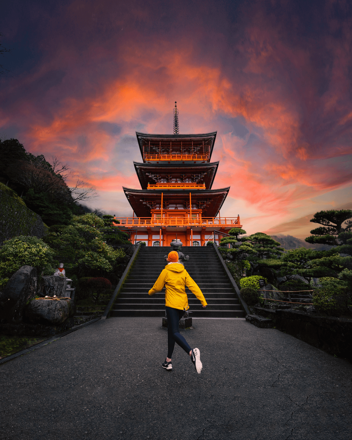
In the next lesson, we’re going to teach you how to replace the sky with an even more dramatic sunset, so that we get something like this:
If you’ve never used lightroom before, here’s a bonus video walking you through the basics like how to import images.
Download Lightroom Classic
This lesson is taught in lightroom classic, available as part of the $10 per month adobe photography plan or via a free 7-day trial. We recommend you practicing with lightroom classic, but if you want to use a different editing software in future you’ll find many of the skills are transferrable.
You can check out Adobe’s plans here.
And you’ll find a free trial here.
And you can download Emilio’s RAW image to practice it for yourself here.